
Project Introduction
This application “MeetMeal” provides food delivery service. It is different from other food delivery applications because it resolves the issue that customers are already hungry by the time they order. The feature of this application is that users can make a schedule for the food delivery. MealMeet’s target customers like people who lack the time to prepare a meal in daily life.
This project shows the development process of a detailed prototype of a new food delivery mobile application. The challenge for this project is to let user easy to schedule a food delivery service on the app. My role for this project is UX designer designing an app for MealMeet from conception to delivery. My responsibilities includes conducting interviews, paper and digital wireframing, low and high-fidelity prototyping, conducting usability studies, accounting for accessibility, and iterating on designs.
Project Research
I conducted interviews and created empathy maps to understand the users I’m designing for and their needs. A primary user group identified through research was working people who don’t have time to cook meals.
This user group confirmed initial assumptions about MealMeet customers, but research also revealed that time was not the only factor limiting users from cooking at home. Other user problems included obligations, interests, or challenges that make it
difficult to get groceries for cooking or go to restaurants in-person.
Personas
Marketing personas are good for determining what types of customers will be receptive to certain products or messages. What they are not good for is for defining a product or service – what it is, how it will work, and how it will be used; or for prioritizing features in a product or service. A persona is a representation of a user, typically based off user research and incorporating user goals, needs, and interests.
Optimist User:
His name is Ben Walker. He is a software engineer work at Apple Company. He is 32 years old and live in San Francisco Bay Area, the city of Sunnyvale. He is single and his income is one hundred and fifty thousand per year. He also has good tech skills. Here are some brands he like and use, like amazon, Gamestop, Bustbuy, Apple and so on. Because his work, he is busy and has no time on cooking for every single day. Base on his situation, I list some point of motivations, goals, and needs with my app. He will be the target user for my app, because he has good tech skills, good income. The most important thing is he has daily need for online food delivery service because his busy working schedule.

Cynical User:
Krystina is 22 years old student at De Anza college. She is living alone in San Jose. As a young people, she has good tech skills, special in social networks. Some brands, like facebook, UO, starbucks are her use and love. She dislikes cooking and enjoys having great meal with good price. She is my cynical user because as a student with low income, she cares about money, so she doesn’t use the online food delivery service often. And, she would like to use the delivery service that she can trust.

Unexpected User:
Her name is Jinnie. She is 45 years old and married. She is housewife lives with her family. She has 2 children. The income for the family is one hundred thousands per year. She likes shopping in the local retail stores. I put some brands over here, like Toys n us, Home depot, TJMaxx, Costco and so on. As a housewife, she enjoys cooking at home and she has never tried online delivery. She has bad tech skills because she is not interested in high technology. So, there are reasons why she is not my target user.

User Journey Map

I created the user journey map for a persona named Ben Walker. User journey is the series of experiences a user has as he interact with my app. I defined Ben Walker’s actions, tasks, feels and opportunities on his journey. This user journey map helps me think and feel like the user, which is super important.
Pain Points

Project Design
UI Inspiration
Meaningful user interface inspiration is about more than visual appeal, it should be about results. For this project, I made three mood boards to show ideations of UI design by using different color tones.


Logo Design
Base on mood boards, I made logo thumbnails which are small, simple, rapid exploratory sketches used to indicate conceptual directions for the application. Also, here are three logo ideations which are low fidelity refined sketches with color, value weight and line based on thumbnail investigation. Logo ideations to create a blueprint for the final digital logo work.


Close-up Storyboards

Based on the Meal Meet app I worked on in earlier activities, I built close-up storyboards that illustrates details about my solution for user needs. These six panels tell the story of how my user has used my design to fulfill their goal. With the six panels of my close-up storyboards I was trying to demonstrate the flow of user actions within the product, and how each step will lead to the next.
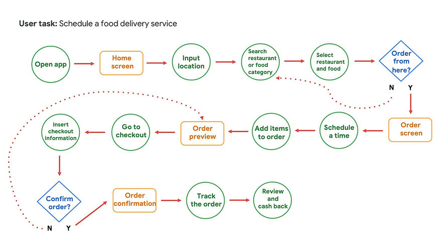
User Flow
The workflow of the application had been defined. The basic user flow of the application includes logo in, sign in/up, menu by foods, restaurants list, user account, schedule for delivery, order (payment) and tracking. Users can use their social media account to log in if needed.
Paper Wireframe

According to the issues I found, I started to refine the functions based on user scenarios I created and observed, and tried to organize the information architecture of the app. The application wireframe was built that I started sketching and prototyping the contents for each page. Taking the time to draft iterations of each screen of the app on paper ensured that the elements that made it to digital wireframes would be well-suited to address user pain points.
Low-Fidelity Prototype

I built a simple low-fidelity prototype in Figma based on the wireframes I created. The low-fidelity prototype connected the primary user flow of building and ordering a food delivery service. With my prototype complete, I can begin testing basic functionality and usability.
UX Research Study (Test)
Usability Study
A usability study is a research method that assesses how easy it is for users to complete core tasks in a design. The goal of usability study is to identify pain points that the user experiences with my designs so the issues can be fixed before the final product launches. During a usability study, I got a chance to see how users interact with my app. I can also interview users to learn more about their experience.


I chose five friends and family members to test my low-fidelity prototype with. They were my test participants. I provided my test users with access to the Figma low-fidelity prototype that I created. This usability study is essential for understanding how real users experience and perceives my design. The feedback I received helps me measure how well my design meets my users’ needs.
Affinity Mapping


Learn Insights from Usability Study
Took the observations I made in my usability testing, identify themes, and develop actionable insights. These insights will be critical as I refine my design.
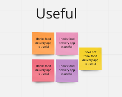
Here are three themes I identified from the UX Study:
-
Based on the theme that: complete the schedule time process quickly, an insight is: it is easy to process the schedule time for almost all users.
-
Based on the theme that: difficulty finding page to edit schedule time, an insight is: most users unsure how to find the page to change the schedule time.
-
Based on the theme that: food delivery food app is useful, an insight is: food delivery app is useful for most people, but not an overwhelming majority.
Accessibility Considerations

Interface Design for Ipad Mockups
The final mockups presented cleaner user flows for ordering a food and checkout. It also met user needs for schedule a delivery.
Ipad Mockups

Style Guide

Mockups
Takeaways
Impact:
This app design resolves the issue that customers are already hungry by the time they order. The feature of this application is that users can make a schedule for the food delivery.
What I learned:
I learned user research and defined the pain point for my app design. Usability studies and peer feedback influenced each iteration of the app’s designs.


