
NeWork App and Responsive Website
Responsive design for multiple devices
Project Overview
This Product
NeWork is a free service to entry-level job seekers, where users can upload a resume, search for jobs, save them and apply to them directly, and track the job status. NeWork’s primary target users include college students, new graduates and job seekers who are looking for a first or entry-level jobs.
The Problem
Most of job application apps provide very few entry-level jobs and the feature of job status tracking. Our product focus on providing a free job search service for college students, new graduates and job seekers who are looking for a first or entry-level jobs.
My Role
UX designer leading the app and responsive website design from conception to delivery.
My Responsibilities
Conducting interviews, paper and digital wireframing, low and high-fidelity prototyping, conducting usability studies, accounting for accessibility, iterating on designs, determining information architecture, and responsive design.
User Research and Understanding the User
Summary
I used competitors’ data on job application service to develop interview questions, which were then used to conduct user interviews. Most interview participants reported feeling badly about apply job service for entry-level job seekers. The feedback received through research made it very clear that users would be open and willing to get a new app focus on job search and easy to apply for college students and entry-level job seekers.
Competitive Audit
In order to inform the design of the employment-oriented online service websites and mobile app, the overall goal for the competitive audit was to: Identify and understand the effectiveness of products and features currently used to job search service.


Creating a list of competitors: First, a search for services that aim to job search service was completed. Then, the competitors’ names and the types of competitor were added to the spreadsheet. For my audit, I decided on a total of three competitors: one indirect competitor and two direct competitors.
Research: I reviewed the competitors’ websites and mobile apps, using the categories listed in the competitive audit spreadsheet. Details and ratings were then entered for each competitor.
Analyzing and summarizing the findings: The information in the spreadsheet was analyzed for trends, strengths, weaknesses, gaps, and opportunities. The competitive audit report template was then used to summarize the findings.
Persona and User Story
I created all elements of two personas for my project, so I got a sense of who my user is and what drives them. Goals and frustrations are highlighted, as well as a breakdown of their demographics. Lastly, a quote featured at the top summarizes their personality, along with a paragraph describing their life at the bottom. My goal is to have a realistic persona to empathize with as I think about the type of design solutions my users might need.

Persona #1 Nikita is a college student who needs to easily to reach out recruiters because she wants to get an intern job before she graduate.
Persona #2 Steven is a new graduate CS student who needs to track his applied jobs because he can get an entry-level job in Bay Area.

User Journey
User journeys build off the empathy maps, personas, and user stories I’ve already created. I made user journeys for personas who would potentially need the product. Instances where the journey can be improved are pulled out as items that can help generate ideas for the product I moved forward.


Base on my user research, I identified findings and opportunities are:
-
Hard to find entry-level jobs
-
Hard to track of applied jobs
-
Users want to apply a job easily
Ideation
Crazy Eights Exercise
Based on the competitive audit we did for personas, I identified gaps and opportunities and drew eight solutions to our problem scenario in eight minutes.

Also, I did a quick ideation exercise to come up with ideas for how to address gaps identified in the competitive audit and problem scenario of personas. My focus was specifically on job search page.

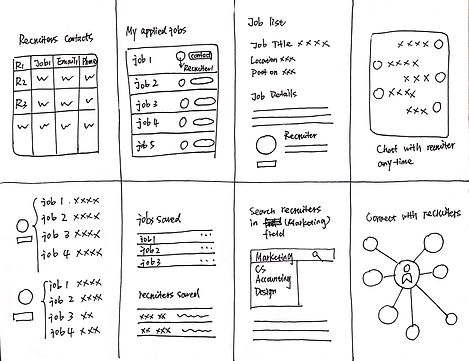
Starting the Design
Digital Wireframes
After ideating and drafting some paper wireframes, I created the initial designs for the NeWork app. These designs focused on job tracking to users to help manage their applied jobs.


Low-fidelity Prototype
To prepare for usability testing, I created a low-fidelity prototype that connected the user flow of search jobs and manage applied jobs.

Usability Study
This research plan wants to test the NeWork app at an early stage of the design process. I want to test the basic functionality and desirability of the product by conducting a usability study. I invited five participants who were looking for their first job. These participants go through the low fidelity prototype I created and gave back to me their feedback.
I gathered, organized, and synthesized the research results and came up with strong insights that’ll help me improve my designs.

Affinity Diagram
Refining the Design
Mockups
Based on the insights from the usability studies, I applied design changes like providing some clear filters to job research, includes the sort of entry-level.
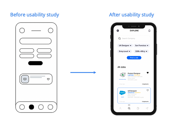
Based on the insights from the usability studies, I applied design changes like making colors for the process of job application.

Mockups


High-Fidelity Prototype
The high-fidelity prototype followed the same user flow as the low-fidelity prototype, including design changes made after the usability study.

Accessibility Considerations
-
Clear labels for interactive elements that can be read by screen readers.
-
Keep the hierarchy and layout of the page logical and organized.
Responsive Design
Sitemap
With the app designs completed, I started work on designing the responsive website. I used the NeWork sitemap to guide the organizational structure of each screen’s design to ensure a cohesive and consistent experience across devices.

Responsive Design
The designs for screen size variation included mobile, tablet, and desktop. I optimized the designs to fit specific user needs of each device and screen size.

Tablet Wireframe

Tablet Mockup

Website Wireframe

Website Mockup
Going Forward
Takeaways
During the usability test and interviews, I got a lot of valuable suggestions and ideas from my users that could help to improve the overall experience of the product. If I had more time, I would spend more time on exploring different solutions. I want to create diverse versions of wireframes to come up with alternative solutions for making the list view look more clean and organized.
Next Steps
-
Conduct research on how successful the app is in reaching the goal.
-
Add company’s review for users to learn about the company when they want to apply the job in this company.
-
Provide recommend jobs for users to match with users’ resume.


